Improving Access and Usability for USDA’s Rural Development Website
Enhancing Digital Accessibility for Rural Communities


Key Takeaways
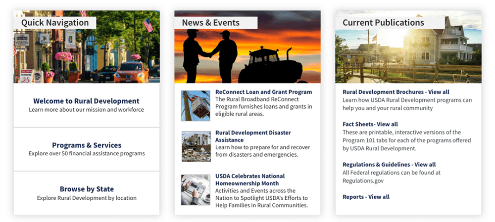
Rural Americans struggled to find housing loans, state programs, and local contact info on USDA's Rural Development website due to complex navigation and unclear labeling
OneSpring conducted mixed-method usability testing and recommended targeted improvements to navigation structure, content labeling, map interactivity, and state filter retention
Task success for housing loan eligibility info reached 80%; contact info found 81% of the time; average task completion time dropped 35% on second attempts
Challenge
The U.S. Department of Agriculture (USDA) sought to ensure that its Rural Development website effectively served users seeking Single-Family Housing Loans, regulatory resources, and state-specific program information.
Despite a comprehensive design, early user testing revealed several usability challenges. Many users self-identified as individuals or families with specific needs—often already aware of the type of loan or grant they were pursuing. However, users struggled to locate information through complex navigation structures, unclear language, and inconsistent interfaces across pages.
Confusion often arose when attempting to identify eligibility criteria or contact local representatives, and users found state-specific program information particularly difficult to access. Participants frequently reported disorientation due to shifting navigation menus and encountered dead ends or redundant pathways that eroded trust and increased task completion time.
Solution
A mixed-method usability testing approach was conducted using moderated and unmoderated tools to examine the site’s ability to support key user journeys. Based on these insights, the project team prioritized improvements grounded in user expectations and digital service design principles.
Recommendations included making the “Programs & Services” navigation menu more prominent, unifying the navigation experience across pages, and redesigning the “I am Looking for…” dropdown to include more contextually relevant options. Interactive components like maps and box modules were restructured to meet user expectations for clickability and clarity.
Additionally, clearer labeling of content such as “Program Fact Sheets” and the retention of selected state filters enhanced findability and reduced cognitive load. Emphasis was placed on restructuring how contact information was presented, especially for states with multiple regions, and offering more intuitive pathways back to the homepage or previous screens.

Results
Implementation of these changes significantly improved users’ ability to locate and act upon information. The task success rate for finding Single-Family Housing Loan eligibility information reached 80%, and users successfully located contact information 81% of the time, often using two or more distinct navigation paths. However, only 20% of users successfully found state-specific Key Programs, which reinforced the need for continued refinement in how this information is surfaced.
On average, task completion times dropped by 35% on second attempts, demonstrating improved learnability of the interface. Satisfaction scores also improved as participants cited the interactive map and visual design as helpful features, even when hindered by menu complexity.
Qualitative feedback pointed to better trust in the website’s comprehensiveness and layout. Participants appreciated having multiple avenues to reach the same destination and expressed greater confidence in navigating the site on future visits.
“The site gave me all the information I needed once I figured out where to look. The improvements made it easier to find answers without getting overwhelmed.”
—Prospective Rural Development Applicant, U.S. Department of Agriculture
Conclusion
By integrating usability feedback into its digital design process, the USDA took a meaningful step toward democratizing access to critical services for rural Americans. The findings informed a series of iterative improvements that significantly enhanced the site’s accessibility, clarity, and user flow. These efforts demonstrate the power of service design in creating inclusive government platforms that not only inform but empower users to take action confidently.
Frequently Asked Questions
Why did USDA's Rural Development website need a UX improvement?
Despite comprehensive content, user testing revealed that rural Americans — who were often already aware of the loan or grant they needed — struggled to find eligibility criteria, state-specific programs, and local contact information due to complex navigation menus, unclear labeling, and inconsistent page layouts.
What usability testing methods did OneSpring use for the USDA project?
OneSpring conducted a mixed-method study using both moderated and unmoderated usability testing. Participants completed key tasks — like finding Single-Family Housing Loan eligibility or locating a regional contact — while providing real-time feedback. This combination captured both behavioral patterns and qualitative insights.
What specific design changes improved the USDA website?
Key improvements included making the "Programs & Services" menu more prominent, unifying navigation across all pages, redesigning the "I am Looking for…" dropdown with more relevant options, restructuring interactive maps and content modules for clarity, improving state filter retention, and creating more intuitive contact information layouts for multi-region states.
What results did the USDA Rural Development website improvements produce?
Task success for Single-Family Housing Loan eligibility reached 80%. Contact information was found 81% of the time, often via multiple navigation paths. Average task completion time dropped 35% on second attempts. User satisfaction improved, with participants reporting greater trust in the site's comprehensiveness and layout.
Why does government website usability matter for rural communities?
For many rural Americans, USDA programs represent critical pathways to housing, agricultural support, and community development. When websites are difficult to navigate, eligible individuals may give up before finding the help they need. Usability directly affects whether government services reach the people they're designed to serve.
How does service design differ from traditional web design for government sites?
Service design takes a holistic view of how users experience a service across every touchpoint — not just what happens on a single page. For the USDA, this meant mapping the full journey a loan applicant takes: arriving at the site, finding the right program, understanding eligibility, and making contact with a local office.
What is the "I am Looking for…" dropdown and why was it redesigned?
This dropdown was intended to help users quickly self-identify and navigate to relevant programs. However, users found the existing options too generic to match their specific needs, leading to confusion and dead ends. The redesign replaced vague categories with more contextually relevant options that matched how applicants actually think about their housing or agricultural needs.