Improving the usability of a leading fintech platform
Redesigning the Corpay One Dashboard for Increased Usability and Engagement


Key Takeaways
Corpay One's dashboard was functional but lacked the intuitive design and scalability needed to serve a growing enterprise customer base
OneSpring redesigned the dashboard UI, built a comprehensive design system, and overhauled navigation for card management, bill pay, and spend analytics
Results: 46% reduction in time-on-task, 76% fewer navigation errors, SUS score of 88, and 38% new feature adoption within the first three months
Background
Corpay is a leading global provider of business payment solutions, offering services that span accounts payable automation, commercial card programs, and expense management. Corpay helps businesses simplify their spend management processes while maintaining control and visibility across all transactions. Corpay engaged OneSpring to help with the UX strategy, research, and design of their flagship product, Corpay One.

Challenge
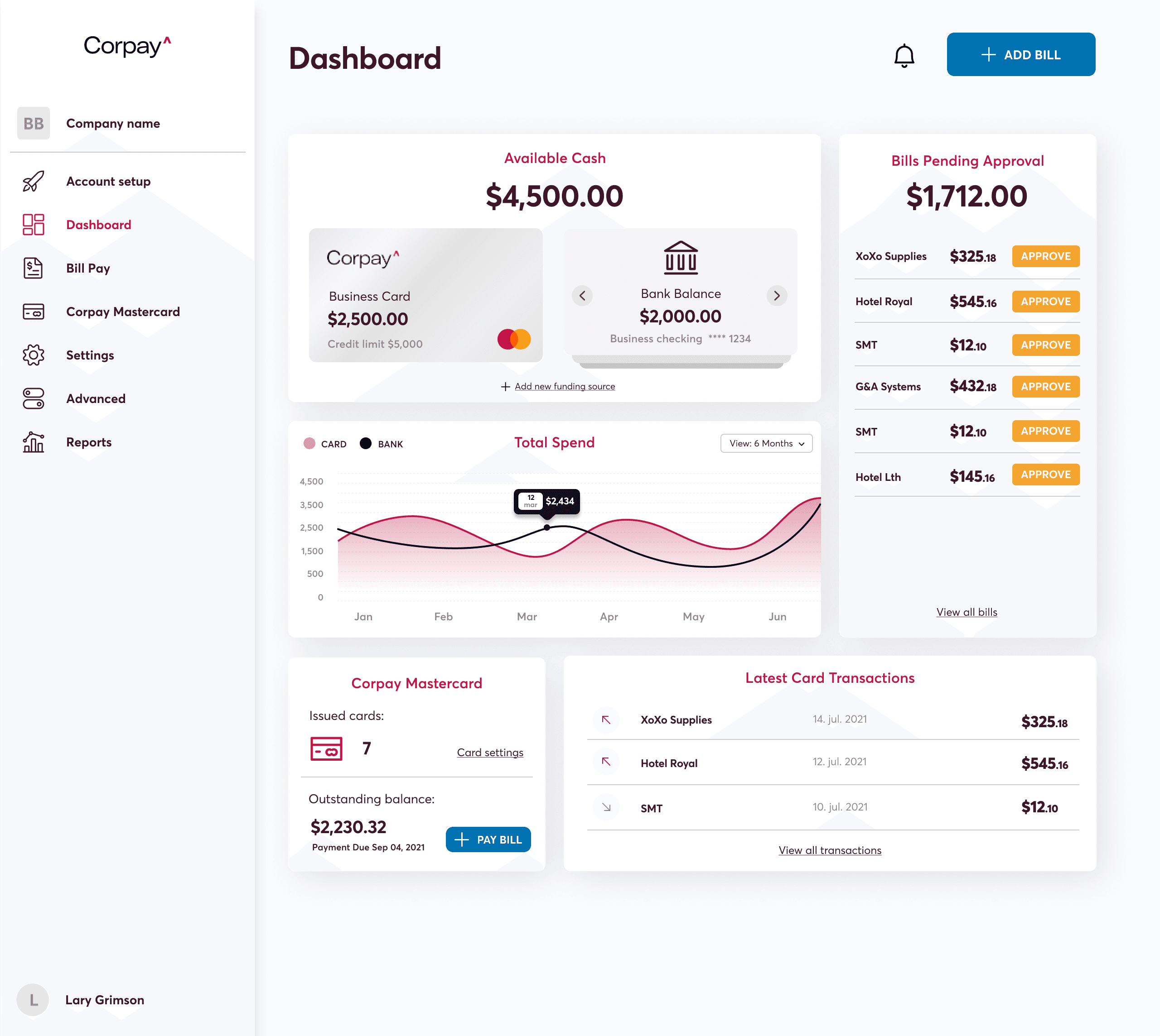
The Corpay One dashboard plays a central role in how customers manage their cards, bills, reporting, and financial workflows. Corpay needed to modernize the Corpay One dashboard to align with evolving user expectations and internal product scalability goals. The existing experience was functional but lacked the intuitive design, navigation clarity, and scalability needed to support its growing customer base.
The primary objectives were to:
Redesign the dashboard UI to reflect modern visual and interaction standards
Establish a comprehensive design system to standardize components across workflows
Improve overall information architecture and navigation clarity
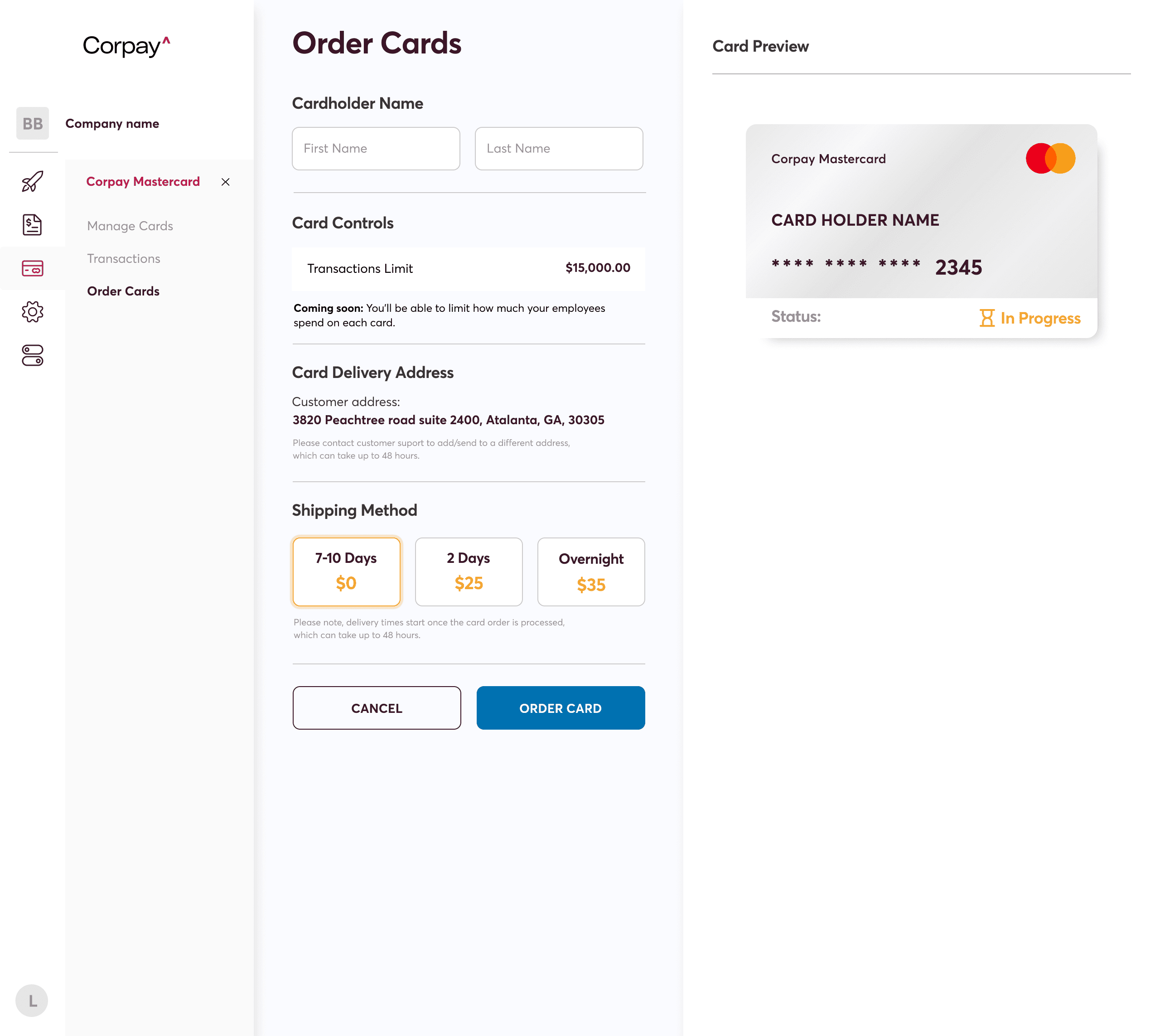
In addition, Corpay needed to introduce micro-interactions to enhance user engagement and revamp key workflows—specifically in card management, bill pay, and reporting—to streamline customer operations and improve task efficiency.
Solution
OneSpring worked in close collaboration with Corpay’s product and development teams to deliver a fully redesigned Corpay One dashboard experience. The engagement spanned UI redesign, workflow development, design system creation, and prototype testing, ensuring a seamless and scalable experience for Corpay’s end users.
User Research and Strategy
Identified key usage patterns across core financial workflows
Analyzed customer goals and friction points within the dashboard
Developed a new information architecture to support intuitive navigation
These efforts ensured design decisions were grounded in user behavior, addressing critical usability gaps in the original experience.
Design and Prototyping
Built a scalable design system with states, specs, and component patterns
Designed micro animations to increase engagement and provide feedback
Delivered interactive high-fidelity prototypes for primary workflows
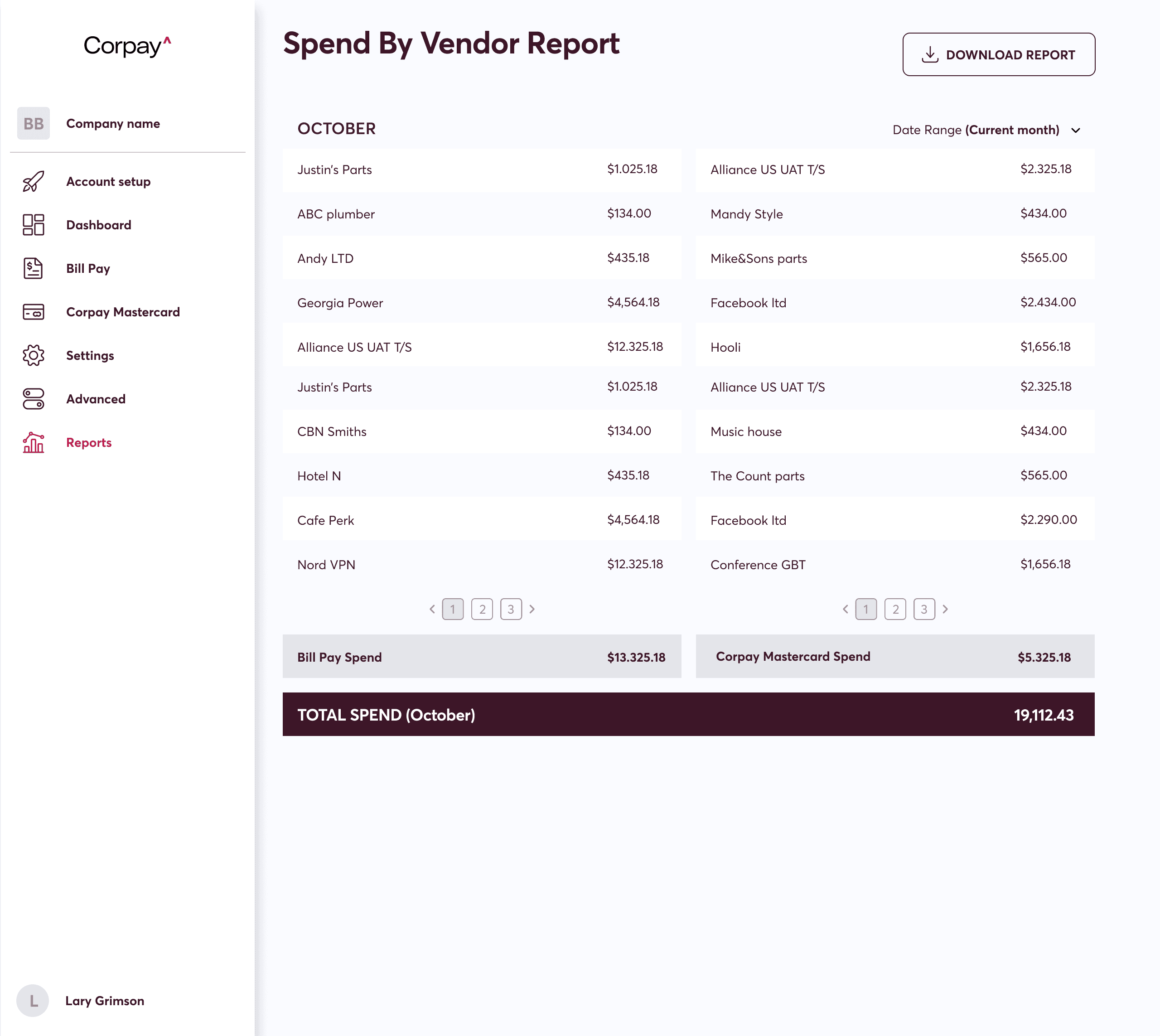
Additional flows included detailed support for card ordering, transaction history, bill approval, and multi-level spend analytics.
Development and Collaboration
Partnered directly with engineering for component-ready handoffs
Delivered fully annotated UI files to support implementation fidelity
Supported agile development cycles with iterative design feedback
This close collaboration ensured seamless design-to-development translation and rapid iteration across sprints.
Results
The redesigned Corpay One dashboard delivered a vastly improved user experience and stronger product engagement metrics. Through OneSpring’s user-centered approach, Corpay achieved measurable improvements in usability and workflow performance.
The product redesign led to:
46% reduction in time-on-task across primary dashboard flows
22% increase in task success rates during card and bill management testing
76% decrease in navigation errors after the information architecture overhaul
Additional results included a 20-point increase in overall product satisfaction (SUS score: 88), a 38% adoption rate for new features in the first three months, and a 42% lift in reporting engagement across the platform.
Conclusion
Through design system innovation, modern UX practices, and close collaboration, OneSpring helped Corpay elevate the utility and sophistication of its flagship financial dashboard. The result is a more intuitive, scalable, and engaging experience that empowers customers to manage their financial operations with confidence and clarity.
Frequently Asked Questions
What is Corpay One and why did it need a UX redesign?
Corpay One is a B2B financial platform for managing cards, bill payments, and spend analytics. While functional, the dashboard lacked intuitive navigation, modern interaction patterns, and the scalability needed to support a growing enterprise customer base — prompting a full UX and UI overhaul.
How did OneSpring improve the Corpay One dashboard?
OneSpring redesigned the UI, developed a comprehensive design system with reusable components, rebuilt the information architecture for clearer navigation, and added micro-interactions for better user feedback. Key workflows — card management, bill pay, and reporting — were all redesigned with user research guiding every decision.
What results did the Corpay One redesign achieve?
The redesign delivered a 46% reduction in time-on-task, 76% decrease in navigation errors, a 22% increase in task success rates, and a SUS (System Usability Scale) score of 88. New features saw 38% adoption within the first three months and reporting engagement increased by 42%.
What is a design system and why does fintech need one?
A design system is a structured library of UI components, states, and usage guidelines. In fintech, where accuracy and consistency are critical, a design system ensures that every screen — from card ordering to transaction history — behaves predictably and looks cohesive, reducing errors and improving trust.
How do micro-interactions improve user engagement in financial software?
Micro-interactions are small animated responses to user actions — like a loading indicator or a success animation. In financial dashboards, they provide real-time feedback that reassures users their actions were registered, reduces uncertainty, and makes the experience feel responsive and polished.
What UX research methods did OneSpring use for the Corpay redesign?
OneSpring analyzed usage patterns across core financial workflows, identified friction points in customer journeys, and developed a new information architecture before any visual design work began. This research-first approach ensured design decisions were grounded in actual user behavior.
How does information architecture affect fintech dashboard performance?
Poor information architecture forces users to search for what they need, increasing time-on-task and error rates. For Corpay, restructuring navigation so users could find cards, bills, and reports intuitively was the single biggest driver of the 76% reduction in navigation errors.